Blanc
A little less browser.
An open-source desktop browser built around one small, floating Island. I took Blanc from concept to public launch on my own: product strategy, UI/UX, brand identity, the design system, and the engineering behind 120 stable releases for macOS, Windows and Linux.
- Product strategy
- UI/UX design
- Brand identity
- Design system
- Engineering
- Launch & support
- 30 daysFirst release to v1.0
- 120Stable releases
- 3Desktop platforms
- 1,189Merged pull requests
The Challenge
Browser chrome takes permanent space, and most browsers keep adding toolbars, panels and AI features on top of it. I wanted a serious, privacy-respecting indie browser that was small and opinionated rather than a Chrome reskin, and that one person could design, build, ship and support.
The Solution
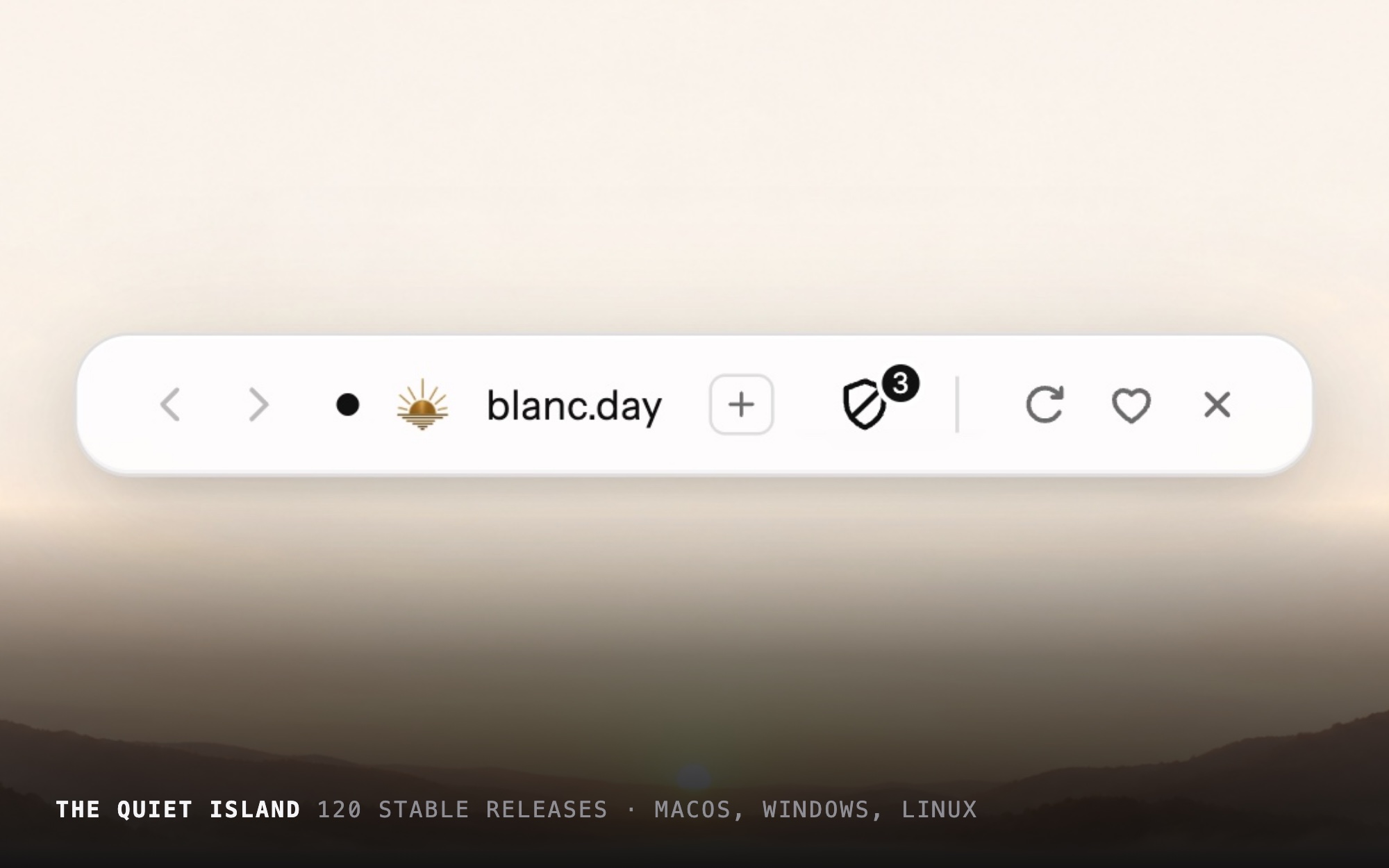
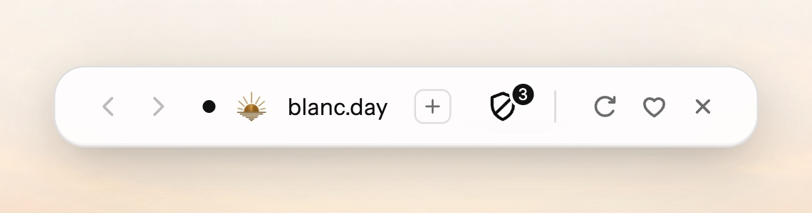
Blanc replaces the tab strip and toolbar with a single floating Island. At rest it shows tab dots, the current site and a live count of blocked ads and trackers. Click it or press ⌘L and it expands in place into a command bar for the address, slash commands and a quick switcher, floating over the page instead of pushing it down. Blocking happens at the network layer, and private tabs run in an in-memory session.
Responsibilities
One person, from concept to launch.
- Product strategy and positioning
- Interaction and UI design
- Naming and brand identity
- Design system and tokens
- Design QA across three platforms
- Engineering, with AI-assisted implementation
- Releases, signing and support
- Marketing site and launch
Tools & Technologies
Design
- Design tokens (light, dark, private)
- HTML prototypes
- Screenshot-based design QA
Build
- Electron (Chromium 152)
- TypeScript
- Network-layer ad blocking
Ship
- Signed macOS, Windows & Linux builds
- Astro marketing site
The Outcome
Blanc launched publicly on Product Hunt and Reddit in September 2026. It ships free and MIT-licensed for macOS, Windows and Linux, has an iOS beta on TestFlight, and has shipped 120 stable releases since its first build in July.
Concept to launch, end to end
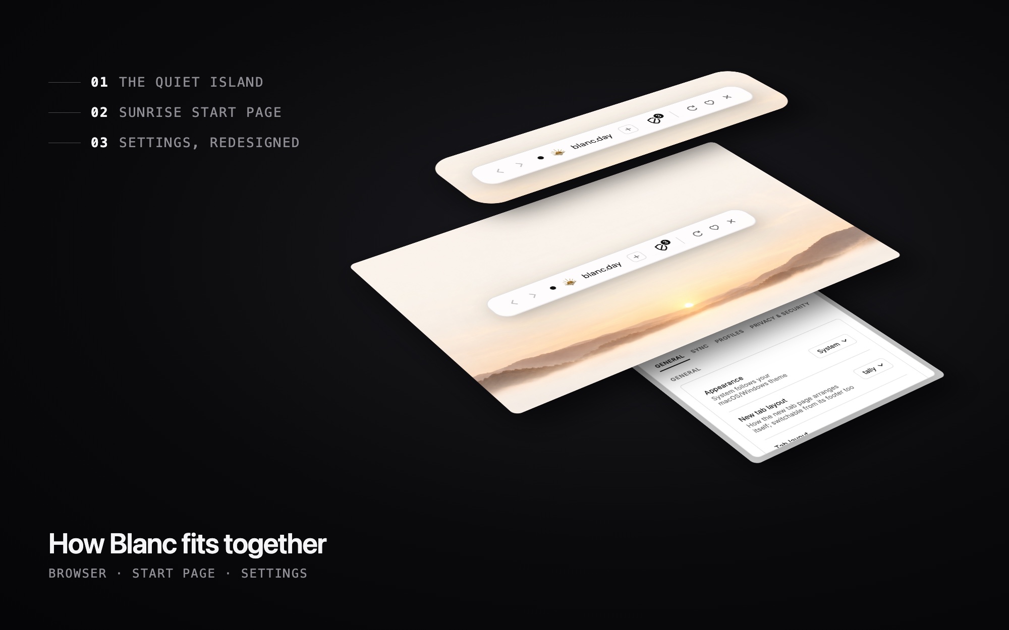
Blanc is the clearest picture of how I work. I wrote the product point of view, designed every surface, built the brand, set up the design system, directed the engineering and run every release. AI tools assist with implementation and security review; I own the product decisions and approve every release, and the project says so publicly.
- 1
July 3 · First public build
v0.1.0 ships with the first Island: a single pill showing the site and a live blocked count.
- 2
July · Rename and rebrand
The working name clashed with a famous video game character, so I renamed the product Blanc, retired the mascot and kept the app ID so existing installs kept updating.
- 3
August 2 · v1.0
Thirty days after the first public build, with signed releases for macOS, Windows and Linux.
- 4
September 17 · Public launch
Launched on Product Hunt and Reddit, then iterated on what people said.
- 5
October · Floating Island and iOS beta
The Island floats over pages by default, and an iOS version opens as a public TestFlight beta.
The Island
The whole product rests on one idea: browser chrome should be as small as possible without hiding anything people rely on. The Island is a single pill that reads as part of the page. It even tints itself with the page’s own top-edge color.
Minimal isn’t hidden
- Back, forward, reload and favorite stay as visible, one-click buttons. Minimal never means making people hunt.
- The pill shows dots only for the active group, capped at eight with a +N count, so it stays readable with many tabs open. I rejected new symbols for scale: the overload was the number of unfamiliar concepts, not the clutter.
- Expanded states float over the page in a transparent layer that exists only while open, so the page never jumps.
Listening after launch
The first Island, in July, was a monospace pill with a blocked count. Launch feedback shaped what came next.
- A Reddit user disliked that revealing an auto-hidden Island pushed the page down. Floating became the default and pushing became an option. The anti-goal was explicit: no transparent layer that steals clicks meant for the page, so only the pill itself floats.
- The macOS window buttons hide with the pill, because they were covering the menu button on sites like YouTube.
- The onboarding step was rewritten around what new users actually missed: “Tabs, search and navigation, all in one place.”
Privacy you can see
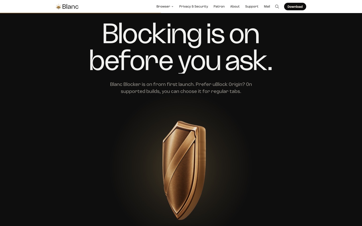
- The shield popover had to read as “protection for this site,” not an unexplained number. It has one site-scoped control. I deliberately left out a global off switch.
- Private mode is a theme scope with its own tokens, hollow tab dots and a private chip. Later I made it quieter by removing the dashed borders.
- There’s no extension runtime, by design. Extensions were the main source of crashes and would have forced the interface to run unsandboxed, so blocking is built in instead.
Memory benchmark from October 2026 (median of three runs). Brave is the fair comparison and the result is close; most of the gap to Chrome comes from blocking ads and trackers.
Brand and design system
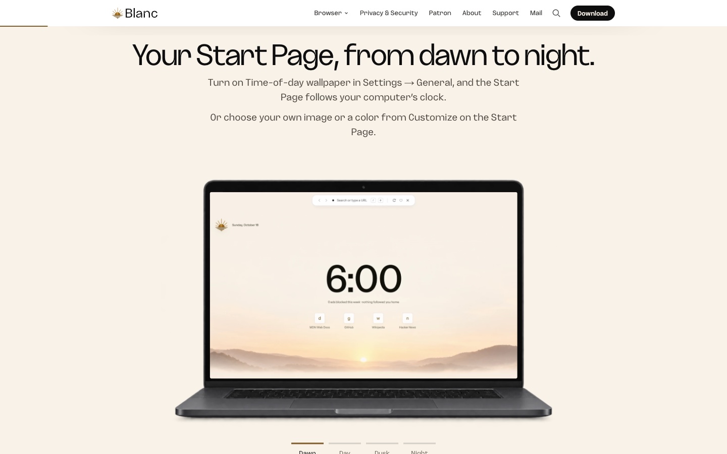


- The identity is a neutral Island with warm “Sunrise” surfaces. The tagline is “A little less browser.”
- 61 design tokens across light, dark and private themes generate platform files for Swift and Kotlin. CI fails if the desktop CSS drifts from them.
- An automated test checks WCAG 4.5:1 contrast for the Sunrise palette in all three themes. The interface respects reduced motion.
- Naming is user-first: “Quiet Tabs” and “Favorites” in the interface, even where the code says tabSleep and bookmarks.
Design QA as a habit
Every visible change is checked against its design before it ships. The QA log runs to more than 2,500 lines, with findings graded P0 to P2, iteration history, accessibility checks, and passes on Windows and Linux virtual machines. Glance, a two-page reference view, was blocked twice before it passed.
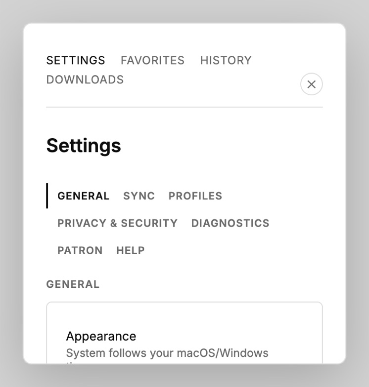
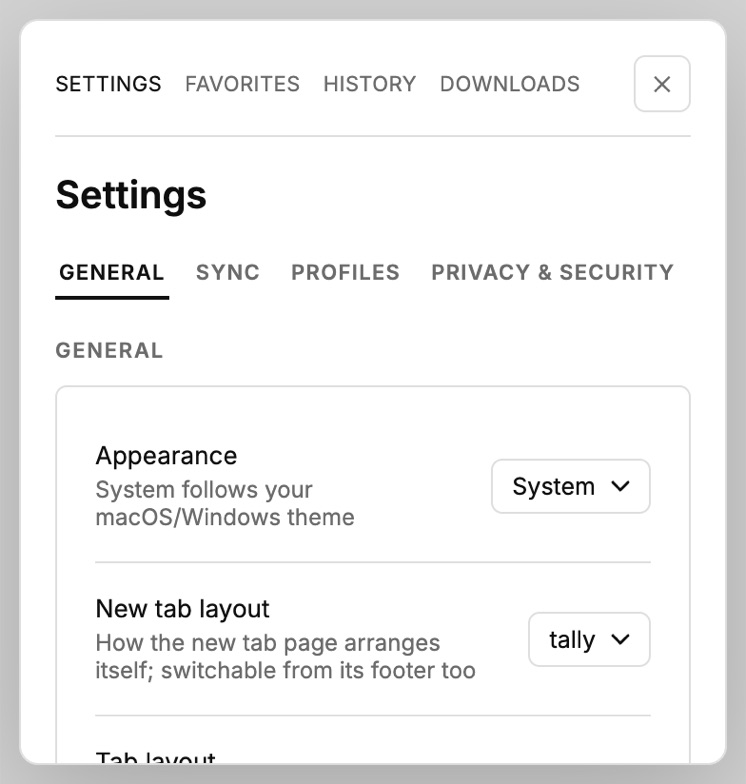
- Quiet Tabs was justified by measurement: discarding an idle tab freed about 148 MB, while backgrounding it saved about 4%.
- Closing a tab returns you to the one you were on before, not the neighbor on the right.
- The Spaces redesign was scoped to two problems, that it was hard to find and looked unfinished, and explicitly not a new switching system.
Want the full story?
I'm happy to walk through this project, the decisions behind it, and what I'd do next.