Scroll
Host your podcast. Promote your podcast.
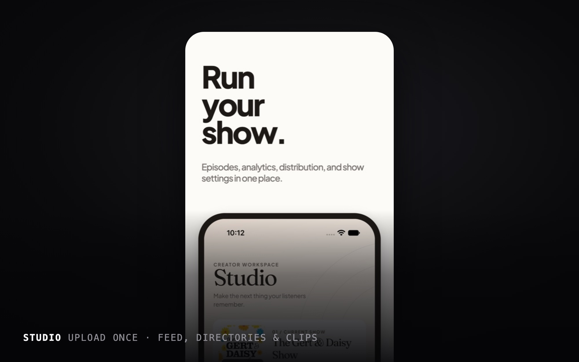
A podcast host, promotion tool and player for iPhone. Scroll launched on the App Store in March 2026 as a creator social platform, pivoted to podcasting in version 4.0, and was sunset in fall 2026. It’s the project that taught me the most about product strategy.
- Product strategy
- UI/UX design
- Brand
- App Store launch
The Challenge
Scroll 1.0 was an all-in-one creator platform with video, live streaming, podcasts, articles and messages. Like most new social products it faced a cold-start problem: it only became useful once it had an audience. Research for the next version pointed at a sharper need. Podcasters’ biggest challenge is being discovered, and most discovery happens through short clips on other platforms.
The Solution
Scroll 4.0 gave one creator value on day one. Upload an episode once and you get a podcast feed, a guided path into the directories, and ready-to-post clips, all from your phone. Promotion happens off-platform, so nothing depends on Scroll having its own network.
Responsibilities
Value for one person, on day one.
- Product strategy and the pivot
- Information architecture
- Interaction and UI design
- Design system
- App Store creative and metadata
- Directing an AI-assisted build
The Outcome
Scroll 1.0 launched on the App Store in March 2026 and 4.0 followed in September. The product was sunset that fall. The pivot’s principles (single-player value, one path per intention, and claims the product can back up) carry into everything I’ve built since.
The pivot
- I chose a creator-first host over a listener app, because a listener app would have hit the same cold-start problem.
- The pivot plan had explicit kill criteria, so success and failure were defined before the work started.
- “Subtract by hiding, not deleting”: navigation was cut first and code removal came later, because hiding is cheap and reversible.
One path per intention
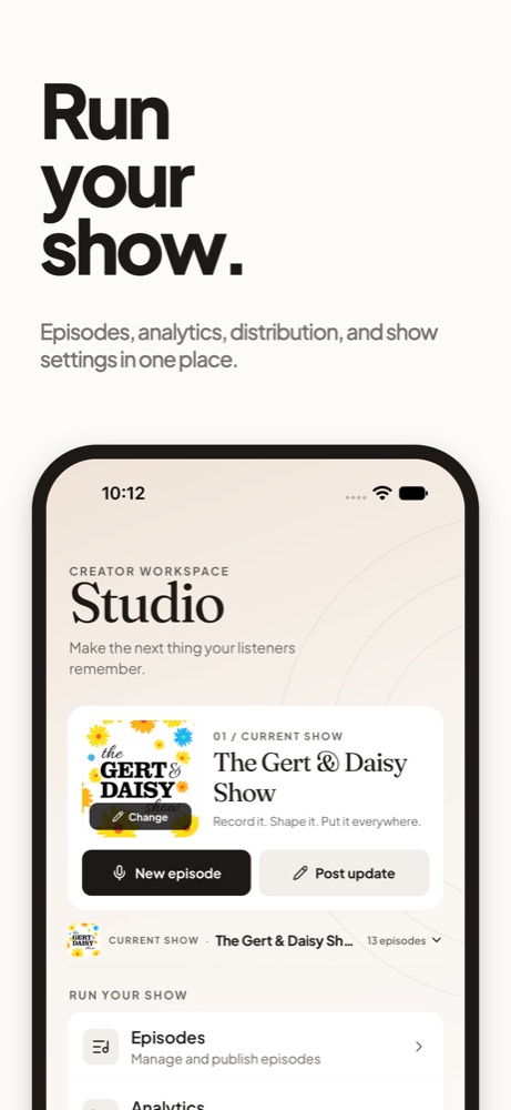
- Navigation is listener-first. When priorities conflict, the listener wins. Creators get one fast path and one destination: Studio.
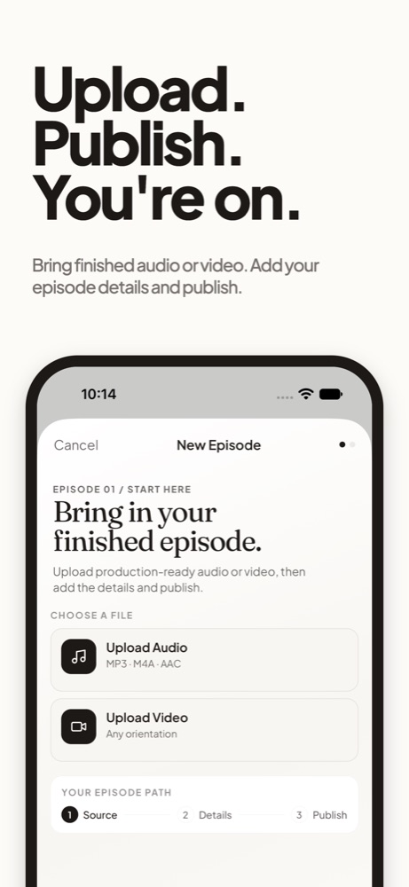
- A 3,263-line, two-mode composer was split into two purpose-built flows, a quick Update sheet and a two-step Episode wizard, each chosen from A/B mockups.
- The Catch Up rail shows only shows with unheard episodes, badged “N new,” and disappears when there’s nothing new.
Promotion and distribution
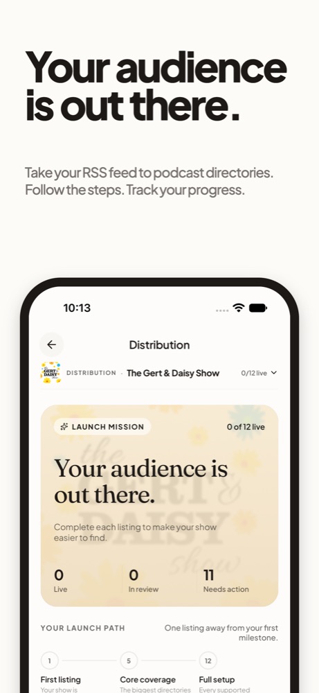
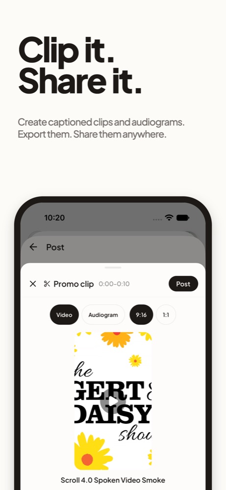
- The clip editor makes 9:16 or 1:1 clips, as video or audiograms, choosing the range from the transcript.
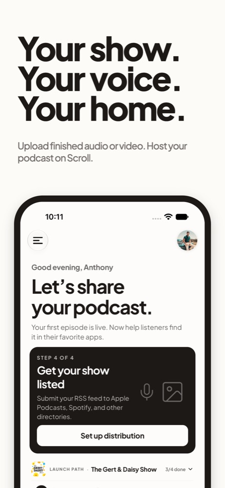
- Distribution became a guided “mission” with progress and real listing detection, so “Listed” is true rather than self-reported.
A warm, monochrome system
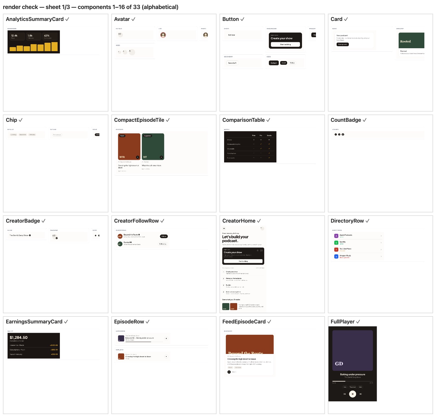
The accent is the ink color; there’s no brand hue. Surfaces are flat with hairlines, and shadows are reserved for floating chrome. The type moved from an editorial serif in early 2026 to Plus Jakarta Sans everywhere, keeping a display serif for Studio headings.
Claims as acceptance criteria
For 4.0, every App Store and paywall claim had to be exercised by the build, and no production screen could show mock data. A ten-step change-control process kept the product honest as it shipped.
Want the full story?
I'm happy to walk through this project, the decisions behind it, and what I'd do next.